Defining a clear value proposition to boost sales
User research
Iterations
Bookings
Overview
Context
Lastminute.com offers travelers the opportunity to make their flight dates flexible in case their plans change. In response to the sustained demand for flexibility after the pandemic, our goal was to adapt our flexible fare trip add-on so it's value resonates with travelers.
Role
Lead designer and researcher covering the end-to-end design process. Collaborated with a PM, content design, my lead researcher, and a team of 10 engineers.
Date
2023 - 2024
Problem
The current design of the flexible product gives an incomplete and misleading overview of the benefits we offer to travelers. How might we design the content so the value proposition is clear and resonates with travelers who value flexibility?
Goals
Impact
+ 4%
Conversion rate, all devices
-30%
Errors in usability testing
Metrics for a checkout reaching 5M+ monthly users
How we got there
Solution

Content-driven design
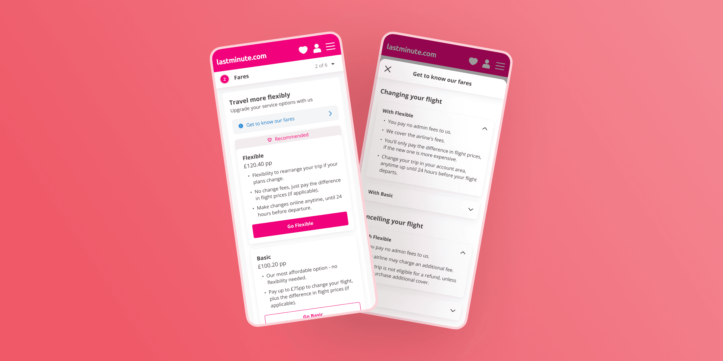
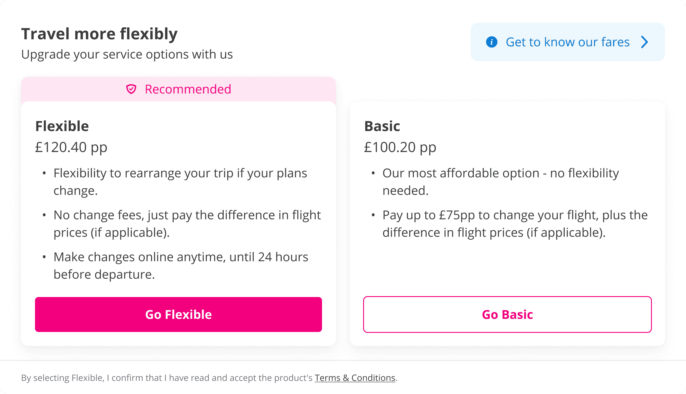
I learned from user testing the original content that users would benefit from more information on the benefits and fees associated with each fare. Some even suggested that the lack of clarity would deter them from purchasing our preferred fare - a big red flag.
With a clear problem to solve, I focused on creating a simple design that would be easy to read and build upon as we iterate.
Hypothesis #1: users will feel supported with longer descriptions

Flexibility as the main value proposition
During user research, I learned that travelers tend to look for flexibility if they are uncertain about their dates but still want to book, and are happy to spend more now to get peace of mind. Travelers who typically choose basic are the opposite; they are confident of their travel dates and want to avoid paying for any extra trip add-ons they likely won't use.
Hypothesis #2: copy should be written to match travelers' preferences.

Travelers can find more information by tapping "get to know our fares," which opens a modal with more details about the benefits and fees associate with each fare. I organized the content by benefit and collapsed information in accordions to make the modal easy to navigate.
Reflection
What I learned
The original version of this trip add-on was a clear example of our poor collaboration with legal. The constraints in place at the time were defined in a way that prevented my team from iterating for longer than I'm happy to admit. In order to move forward with this redesign, we knew we had to change our approach to working with legal. We reached an agreement to go for a guideline-driven approach, prioritizing clarity demonstrated through user research rather than simply using copy provided by legal.